

A national training center shaping Belgium’s next generation of professional transporters
PTTC plays a central role in training and certifying Belgium’s professional drivers, but their identity and online presence were no longer reflecting their impact or ambitions. As their audience grew and their programs expanded, PTTC recognised the need for a stronger brand and a clearer digital platform to communicate their mission. We refreshed their visual identity and designed a user friendly website that helps drivers find the right training, understand certification steps, and stay connected with the organisation more easily.


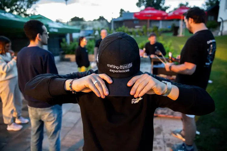
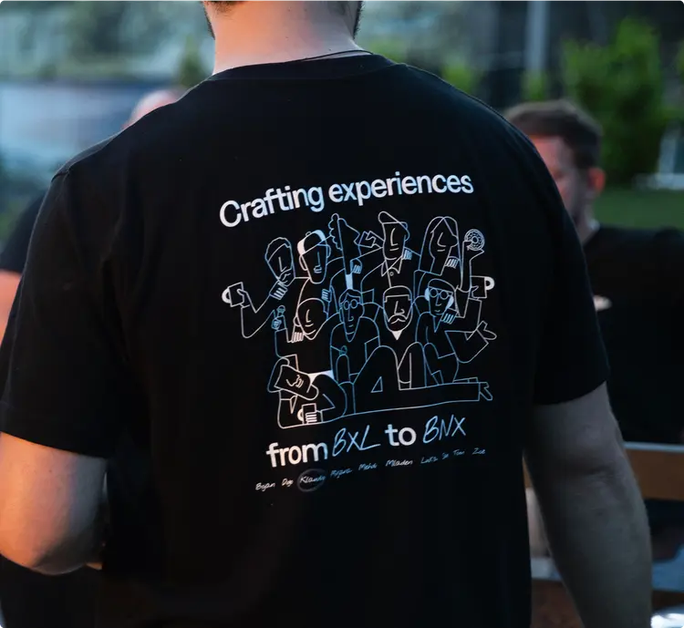
Team in charge
Design & development
Sam
Project manager
Diogo
Lead design
Klaudio Milankovic
Lead developer


Branding
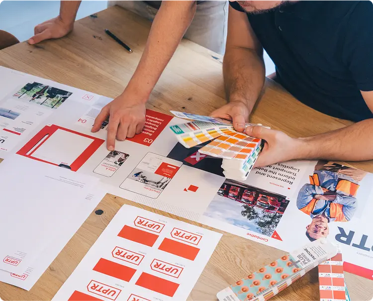
Redefining PTTC’s identity meant modernising a well established training institution without losing the trust it built among Belgium’s professional drivers. The challenge was to create a visual system that feels current, reliable and approachable while still reflecting PTTC’s role in safety, expertise and qualification. Through a focused strategy and a clean, structured design language, we developed a brand that communicates clarity and professionalism across every touchpoint. The result is a refreshed identity that supports PTTC’s growth and strengthens its presence both online and offline.
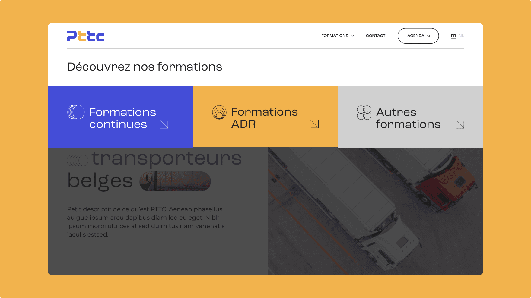
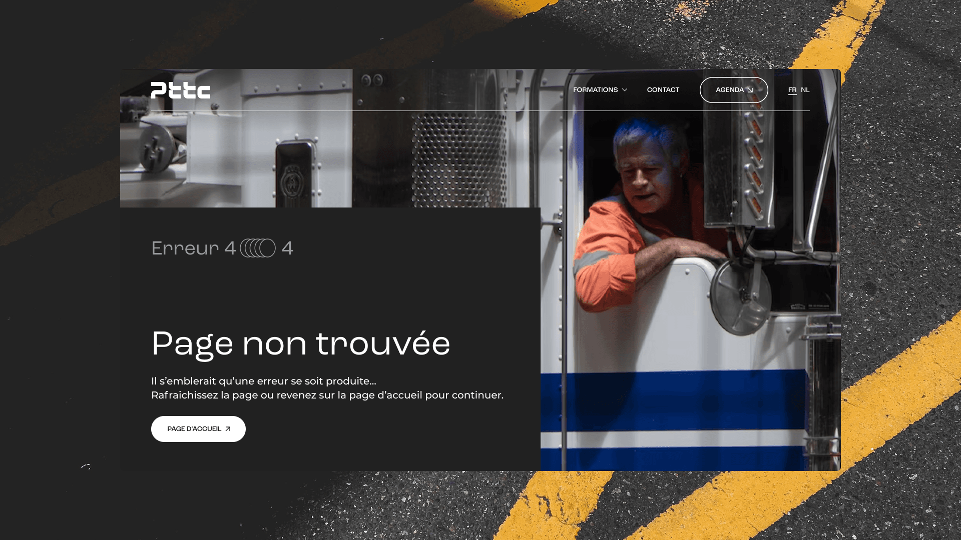
Website
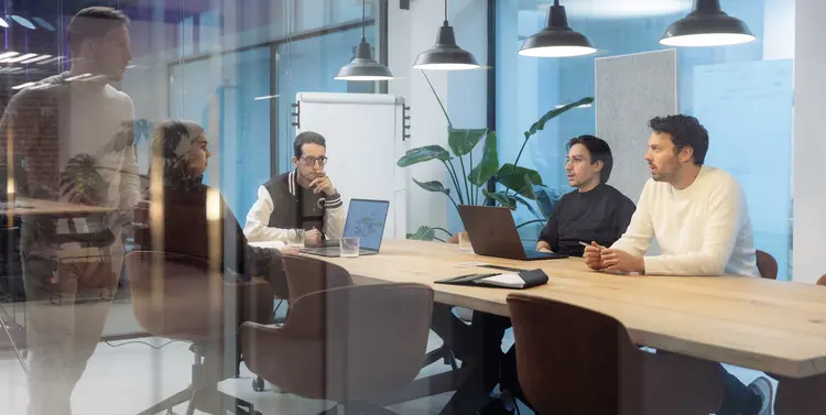
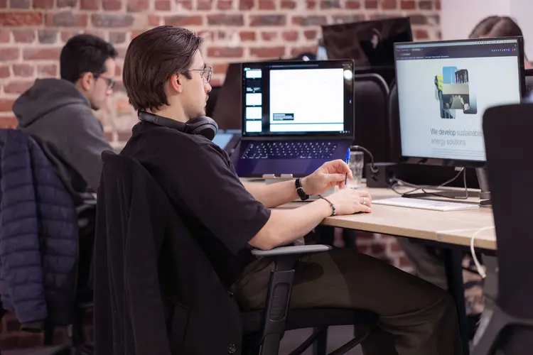
We redesigned and rebuilt PTTC’s website with a strong focus on clarity, easy navigation and helping drivers quickly find the training they need. After auditing the old platform, we restructured the entire content architecture around real user journeys, making certification steps, course details and contact points straightforward to access. The interface was shaped through iterative prototypes and feedback, resulting in a clean, intuitive design that brings the new brand system to life. Developed with modern, performant technology, the site is fast, secure and fully responsive, giving learners and professionals a seamless experience across all devices.
Nous avons fait appel à studio ruelle pour repenser notre image de A à Z : identité visuelle, photos, visuels, logo, slogan, site web et sa gestion. L’équipe s’est pleinement investie pour comprendre nos besoins et y répondre avec rigueur et créativité. Ils ont pris le temps d’écouter, de s’adapter, et de livrer un résultat à la hauteur de nos attentes, même pour nos sites les plus complexes. Une collaboration à la fois humaine et professionnelle.
Michaël Reul
Secrétaire Général

Next

Whitepaperlaw