


Human rights to the front
When CCSP set out to modernize how human rights information is presented in Belgian prisons, they needed more than a surface update. They needed a brand and a digital platform that could match the weight of their mission and make their documentation genuinely accessible. Our role was to rethink their visual identity and rebuild their website from the ground up, creating a system that feels authoritative, clear, and human. The result is a unified brand and a streamlined site that improves transparency, strengthens credibility, and makes critical information easier to reach for everyone who relies on it.


Team in charge
Design & development
Tom
Project manager
Diogo
Lead design
Klaudio Milankovic
Lead development
Bojan
Developer


Branding
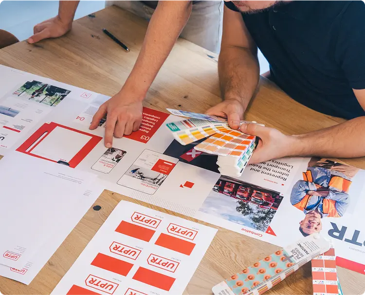
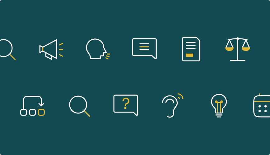
CCSP approached us with a clear need: modernize their identity so their mission around human rights in Belgian prisons is communicated with authority and clarity. We built a brand system that feels institutional but human, precise but accessible. Typography, colors, layout rules, and iconography were redefined to support transparency and legibility across all materials. The result is a cohesive visual language that strengthens CCSP’s credibility and makes their documentation easier to navigate and understand.
Website
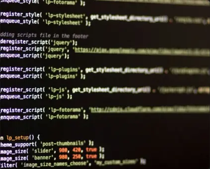
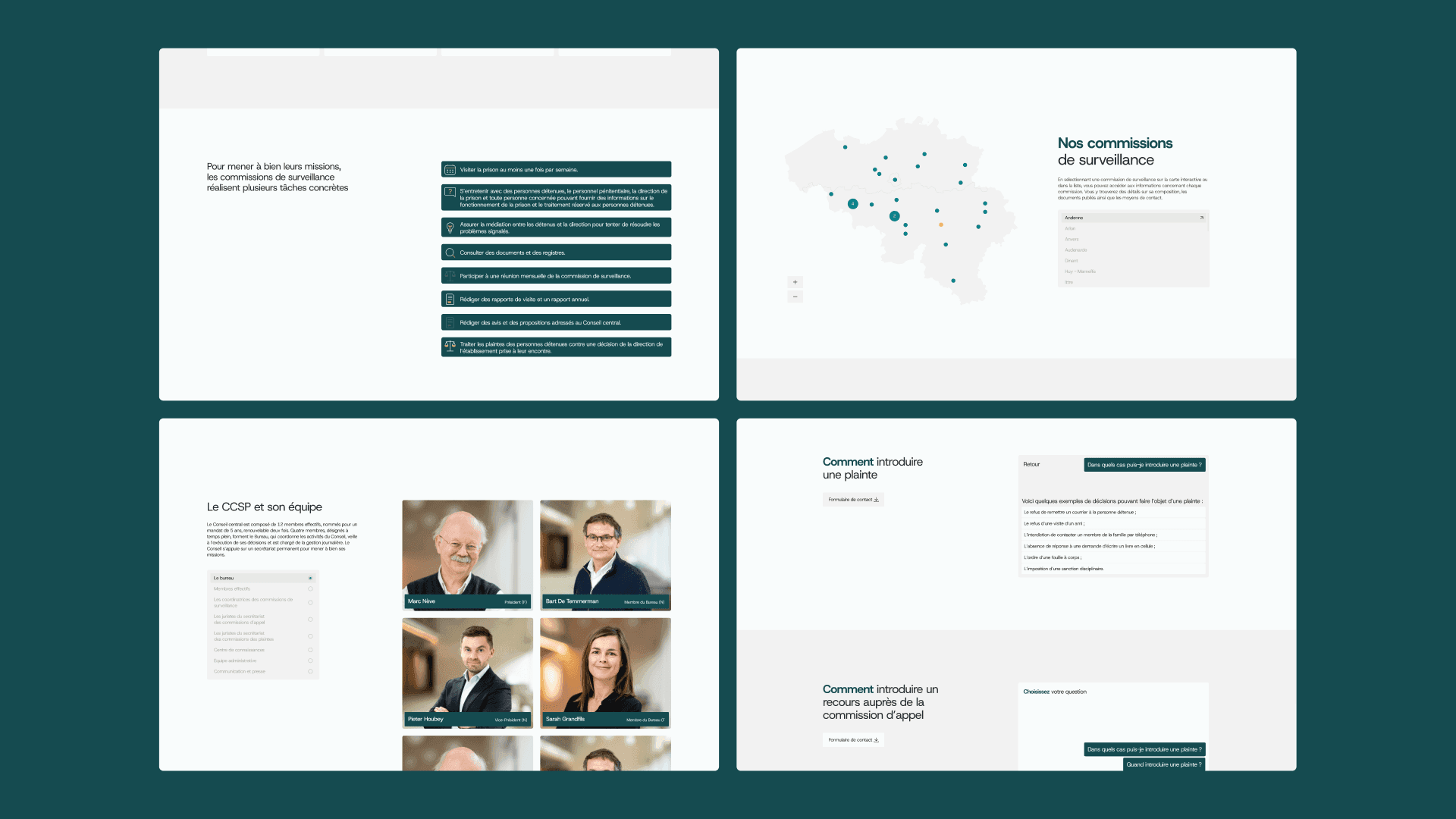
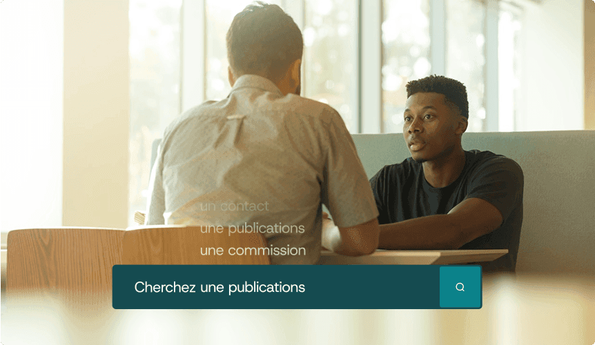
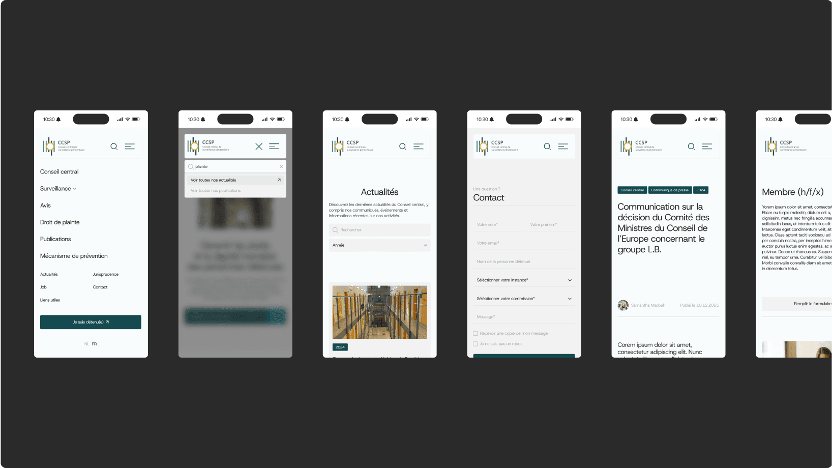
We rebuilt CCSP’s website from scratch to make their human rights documentation far easier to find, read, and manage. The new platform uses a clean content structure, clearer navigation, and a flexible WordPress system that keeps everything intuitive for the team. Every page is designed to reinforce transparency and credibility while staying accessible to a wide range of users. The result is a streamlined site that delivers clarity on the front end and simplicity on the back end.
Personal and easy to work with. Strategic and yet very operational with a good overview on priorities. Always on the quest to get better.
Kim Sersté
Senior communications specialist

Next
Euroanaesthesia